- Introduction to Event Draping
- The Role of Aesthetics in Event Draping
- Exploring the Influence of Colors in Event Draping
- The Power of Patterns in Event Draping
- Combining Colors and Patterns for Effectual Event Draping
- Practical Tips for Event Draping
- Conclusion: Crafting Aesthetically Pleasing Event Draping
- Frequently Asked Questions
Introduction to Event Draping
Understanding the Basics of Event Draping
Event draping is more than just fabric on walls or ceilings; it’s the essence of venue transformation. Its fundamental principle lies in enhancing and complementing the innate character of an event space. Like an artist uses a canvas to bring their imagination to life, event planners use draping to set an event’s mood, tone, and narrative.
Quest Events stands at the forefront of this transformative art, showcasing how meticulous attention to color, texture, and pattern can redefine a space’s essence. The synergy between draping and other venue elements—lighting, stage setups, and thematic decor—conjures a cohesive and immersive environment.
The Significance of Draping in Events
When you step into a venue, the intangible feeling and ambiance often make an indelible mark. Draping plays a pivotal role in sculpting this very ambiance. It’s not just fabric; it’s an emotion, an experience, and an expression.
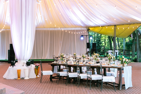
Consider the soft elegance of a wedding, where cascading drapes adorned with twinkling fairy lights paint a picture of fairy-tale romance. On the other end of the spectrum, corporate events, which require a balance of professionalism and allure, benefit from draping that aligns with the brand’s color palette and ethos. A product launch might use bold, dynamic draping to emphasize innovation. At the same time, an annual conference could opt for subdued, elegant fabrics that foster a sense of community and learning.
Furthermore, draping can be a strategic tool. It can guide attendees’ attention to focal points, such as stages, display booths, or even mask areas that aren’t part of the event narrative. This dual functionality—aesthetic and practical—underscores the immense significance of draping in events.
As we delve deeper into this guide, we’ll unravel how colors and patterns, two primary components of draping, shape an event’s story, mood, and experience. Through this exploration, we aim to empower event planners and enthusiasts with the knowledge to craft unforgettable venue aesthetics.
The Role of Aesthetics in Event Draping
Defining Aesthetics in the Context of Event Draping
In the realm of event draping, aesthetics revolves around the appeal and beauty brought about by the choice of fabrics, colors, and patterns. It’s about creating visual and emotional harmony in a space. While the function is essential – like concealing unwanted elements or dividing a room – the form, or how it looks and feels, plays a pivotal role in defining the attendee experience.
The Impact of Visual Aesthetics on Event Attendees
Visual aesthetics, particularly in event draping, can leave a lasting impression on attendees. A harmonious blend of colors and patterns can evoke emotions, from serenity to excitement. For instance, imagine entering a conference with bright, bold drapes filled with energetic patterns. Such a setting instantly uplifts the mood, fostering an environment of creativity and enthusiasm. On the other hand, softer colors and delicate patterns evoke feelings of calm and sophistication.
Exploring the Influence of Colors in Event Draping
The Psychology of Colors in Event Draping
Colors are not just mere visual elements; they carry profound psychological significance. Each color has the power to evoke specific emotions or reactions. For example:
- Red: Often seen as bold and passionate, it can instill feelings of love or energy.
- Blue: Reflects calmness, trust, and stability.
- Green: Symbolizes growth, harmony, and freshness.
- Yellow: Represents optimism, clarity, and warmth.
By understanding these associations, event planners can select drapes that align with the intended mood or theme of the event.
Choosing the Right Color Palette for Your Event Draping
Choosing the right color palette is paramount. Begin by understanding the event’s purpose and the desired emotional impact. For romantic occasions like weddings, softer hues like pinks, lavenders, and creams might be apt. Corporate events require more neutral or brand-specific colors.
Always consider the venue’s existing aesthetics. The aim is to enhance, not clash. A venue with wooden interiors might benefit from earthy tones. In contrast, a more modern, minimalist venue might shine with brighter, contrasting colors.
The Power of Patterns in Event Draping
An Overview of Patterns in Event Draping
Patterns, much like colors, can transform a space. They add depth, texture, and layers to an event’s aesthetics. From classic damasks, modern geometrics, and subtle florals to bold stripes, patterns infuse character and tell a story. While colors create mood, patterns accentuate it, adding richness and dimension to the draping. For instance, a simple white backdrop can be dramatically transformed with a subtle lace pattern, giving it a touch of elegance and sophistication.
How to Choose the Right Pattern for Event Draping
Choosing the correct pattern is akin to creating a visual symphony. Here’s how you can strike the right note:
- Determine the Event’s Tone: The pattern should echo the event’s essence. You might opt for patterns that exude professionalism, such as muted geometric designs, if it’s a corporate event. For a wedding, flowing patterns with soft curves might be more fitting.
- Scale Matters: Larger venues can handle bold, large-scale patterns, while more intimate spaces might benefit from smaller, more delicate designs. Remember, you want the pattern manageable for the area and the guests.
- Coordinate with Colors: Patterns aren’t standalone; they interact with colors. Ensure that the pattern complements the chosen color palette through contrast or harmony.
Combining Colors and Patterns for Effectual Event Draping
Understanding the Interaction Between Colors and Patterns
When colors and patterns come together in event draping, they form a dynamic duo. They dance in harmony or clash dreadfully, so understanding their interaction is paramount. Think of it as a dialogue: while a color might whisper elegance, a pattern can either echo that sentiment or introduce a twist, like a touch of whimsy or drama.
For instance, a deep navy blue paired with a gold geometric pattern can conjure images of opulence and luxury. Conversely, the same blue and soft floral in pastel hues can create a serene and romantic feel.
Tips for Successfully Blending Colors and Patterns
- Start with a Base Color: Before diving into patterns, establish a primary or base color. This provides a solid foundation upon which patterns can play.
- Limit the Number: While mixing patterns can be fun, doing just what is necessary is wise. Stick to two or three patterns at most to maintain a cohesive look.
- Vary the Scale: If you blend multiple patterns, combine large and small-scale designs to provide visual interest without overwhelming the senses.
- Use Neutral Breaks: Introduce a neutral color or pattern when in doubt. This offers the eyes a resting spot and balances the overall design.
Practical Tips for Event Draping
Factors to Consider When Draping an Event
Embarking on an event-draping endeavor is not just about colors and patterns; practicality is vital. Here are some critical aspects to consider:
- Venue Specifics: Every venue is unique – from its size to architecture. Understanding the venue’s layout, ceiling height, and wall textures is crucial. This knowledge dictates the type and amount of fabric needed and the feasibility of certain draping styles.
- Lighting Interplay: Draping and lighting are symbiotic. The translucence of the fabric, combined with lighting, can either amplify or mute the colors and patterns. Before finalizing drapes, consider the lighting arrangements and how they affect the final appearance.
- Budget: As with any event aspect, finances play a role. However, many fabric options make achieving a desirable look possible without breaking the bank. Prioritize what’s essential and where you can compromise.
- Installation & Dismantling: The beauty of draping should be consistent with its functionality. Consider how the drapes will be set up and taken down. Ensure that the installation process doesn’t interfere with other event preparations.
Common Mistakes to Avoid in Event Draping
While draping can transform a space, errors in its execution can mar an event’s aesthetics. Here are some pitfalls to avoid:
- Overcrowding: Less can often be more. Don’t overburden the space with too many patterns or colors. The aim is to enhance, not suffocate.
- Ignoring Acoustics: Fabric affects sound. Especially for events where sound quality is paramount, like conferences, ensure your draping material doesn’t adversely affect acoustics.
- Safety Oversights: Safety first! Ensure the draping material is flame-retardant and the setup is secure, especially in high-traffic areas.
- Mismatch with Event Tone: Always ensure the draping resonates with the theme. A futuristic tech conference might not benefit from vintage lace patterns!
Conclusion: Crafting Aesthetically Pleasing Event Draping
Event draping is an art and science that merges aesthetics with functionality, creating transformative spaces that resonate with an event’s purpose and theme. Let’s delve deeper into the crucial takeaways and envision the promising trajectory of event draping aesthetics.
Key Takeaways in Colors and Pattern Selection for Event Draping
- Alignment with the Theme: Always ensure your draping choices, both in color and pattern, speak in harmony with your event’s central message, brand, or mood.
- Harmonious Balance: Striking a delicate balance between boldness and subtlety ensures that the draping neither overpowers nor gets overshadowed. It should serve as an enhancer of space, not a dominator.
- Prioritize Functionality: It’s essential to remember that while aesthetics are paramount, functionality is crucial. Draping should never impede the event’s operations, safety, or other logistical aspects.
The Evolution and Future Trajectory
As we look to the future, the horizon of event draping holds limitless potential. With the rise of technology and sustainable practices, we anticipate:
- Sustainable Draping: As the world shifts towards eco-friendly choices, we’ll likely see more recyclable, biodegradable, or repurposed materials making their mark in event draping.
- Interactive Drapes: Technological advances may lead to fabrics that change colors or patterns on demand or even interactive drapes that respond to touch, sound, or light.
- Global Influences: With the world becoming more interconnected, we foresee a fusion of global design aesthetics, where patterns and colors from various cultures blend to create unique draping masterpieces.
Final Thoughts
Draping stands at the intersection of design and utility. Executing with thought and precision elevates an event from the ordinary to the extraordinary. At Quest Events, we understand the nuances and intricacies of event draping, ensuring that our clients experience nothing but the best. As we move forward, we remain committed to pushing boundaries, staying ahead of trends, and redefining the aesthetics of event draping for all our esteemed clientele.
Frequently Asked Questions
What type of draping material is best suited for outdoor events?
Using durable and weather-resistant fabrics like polyester blends for outdoor events is advisable. These materials can withstand elements like wind and drizzles. However, always be prepared with additional coverings or backup plans in case of unexpected weather changes.
How can I ensure my event’s draping aligns with the latest design trends?
Staying updated with the latest trends is a combination of research and collaboration. Subscribe to event planning and design magazines, follow leading event planners on social media, and consider consulting with professionals like us at Quest Events. We keep a pulse on the latest in the world of event aesthetics.
Can lighting be incorporated into the draping design?
Absolutely! Combining draping and lighting can create a magical ambiance. Translucent fabrics can be backlit for a soft glow, while thicker drapes can be spotlighted or paired with fairy lights for a sparkling effect. Always work with a professional lighting team to ensure safety and the desired visual outcome.
Is there a quick rule-of-thumb for matching colors and patterns for my event?
While there’s no one-size-fits-all rule, a general guideline is to start with your event’s theme or purpose. Choose a primary color that aligns with the mood or branding, then select complementary or contrasting patterns. Always remember to strike a balance; if you go bold with color, consider subtler patterns, and vice versa.
How do I choose between neutral versus bold draping colors for my event?
The choice between neutral and bold hues largely depends on the event’s purpose, theme, and desired ambiance. Neutral colors offer versatility, creating a sophisticated and timeless backdrop for many occasions, including corporate meetings or elegant weddings. On the other hand, bold colors make a statement. They are perfect for themed parties, brand launches, or events that evoke strong emotions. Consider your event’s objectives, the mood you want to convey, and other decor elements when deciding.